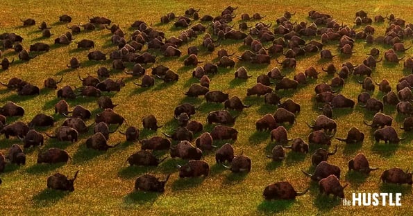
Last November Pixar released The Good Dinosaur, a story about a lost dinosaur trying to find his way home. It’s a pretty typical Pixar story line. The dinosaur thinks he’s trying to find his way home but really he’s trying to find himself. Great. Another good one from the animation kings.

However, last week a Reddit user pointed out something amazing when he removed the dinosaurs from the movie and posted screenshots from the scenery: The Good Dinosaur completely raised the bar for CGI.
Check out the photos below to see for yourself. In many cases it’s tough to distinguish what’s a real photo and what’s a screenshot from the movie.
To create the amazing landscape, Pixar created a 178 square mile virtual map based off of Wyoming. The Pixar team was so detail oriented that they create 187 different types of clouds based off of data from government satellites, and then using weather data, baked in wind, rain, and sunlight into the clouds.
With Pixar making such amazing landscapes we’re left wondering how these types of movies will be classified in the future. The line between animation and real life is getting oh so thin.
Absolutely breathtaking.


