The evolution of websites
A look at how the most popular startups have changed since they started

We often believe that the things we think are great started that way. Alas – that couldn’t be further away from the truth. Stephen King wasn’t always a great writer, Hoobastank didn’t start as the voice of our generation, and Airbnb wasn’t always a sexy as hell startup.
Allow me to prove it to you. With no more ado, I give to you the evolution of your favorite startups and websites.
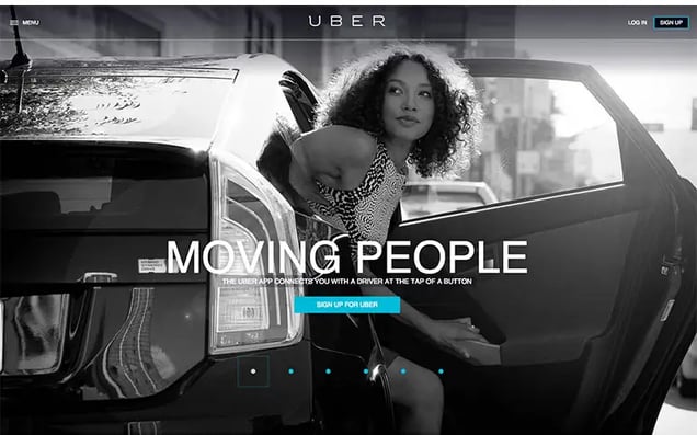
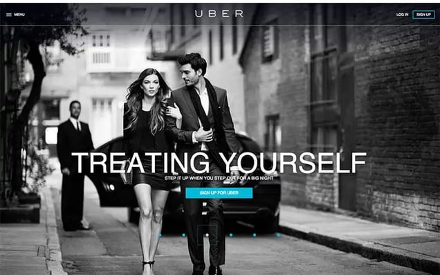
Uber
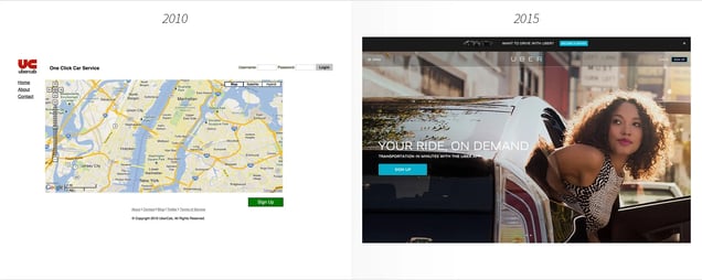
It’s hard to imagine that 7 years ago a $50 billion company didn’t even exist, but it’s true.
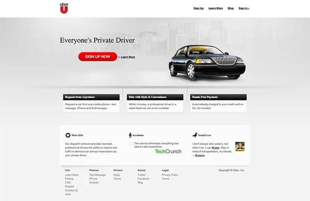
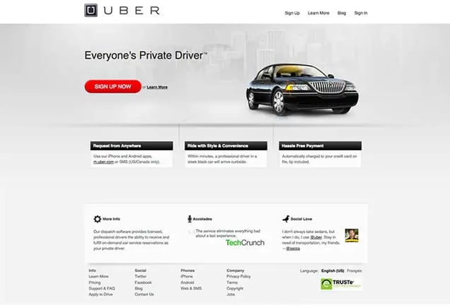
Founded in 2009 as UberCab, Uber started as black car service app.
Garrett Camp and Travis Kalanick created Uber to feel like VIPs when going to clubs. Their first website was only used by friends. Its design was bare, four links and a bright red “UC” for the logo.
In 2012 they rebranded. UberCab.com became Uber.com.
Uber purchased the dot-com domain from Universal Music Group, who had used it as a social networking website. Uber paid Universal 2% of their stock for the domain. A few years later, Uber bought their stock back for $1 million.
Those shares would be worth over $900 million today. Holy hell Universal, way to blow that one.
In 2012 Uber changed their red logo into a slick silver and black design; fitting, considering the fast one they pulled on Universal that year.

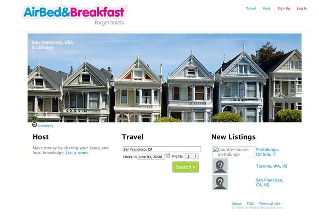
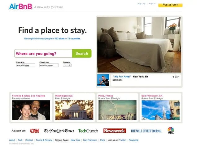
Airbnb
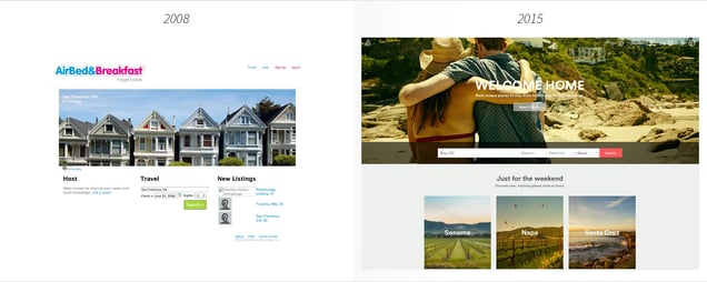
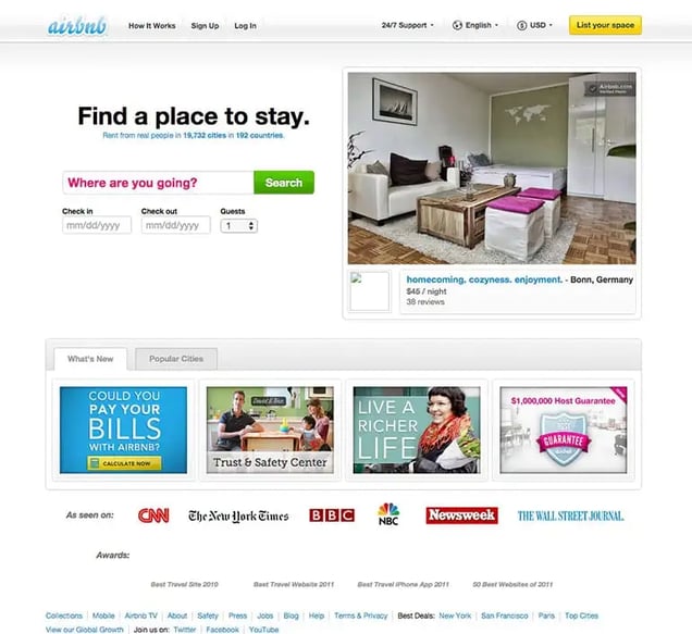
Before Airbnb was Airbnb, it was Airbed and Breakfast. It didn’t become Airbnb until 2009, one year after launch. Two years later the company began sending professional photographers to people’s homes. They’d realized that homes with beautiful photos received 40% more bookings.
That’s when their website became more photocentric, which is how it is today.
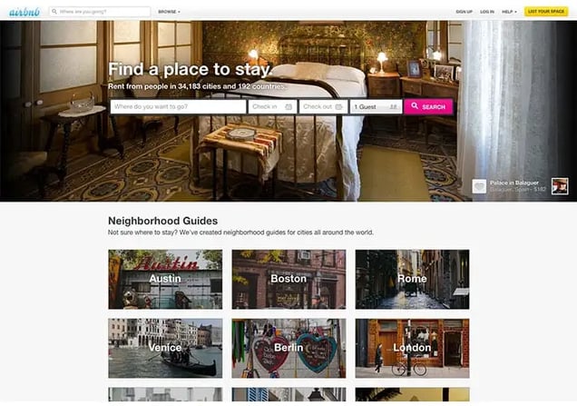
And they kept evolving. Airbnb changed to flatter colors and square shapes instead of the typical shiny and round design that was typical for web 1.0. In 2012 they overhauled the whole website. What you see today is pretty similar to their 2012 design with the addition of their 2013 logo rebrand (which Tumblr thinks looks a ladypart).
Aside from the design, Airbnb has had lots of different taglines. “Forget hotels,” “A new way to travel,” and “Welcome Home” have all been used.
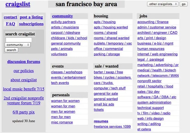
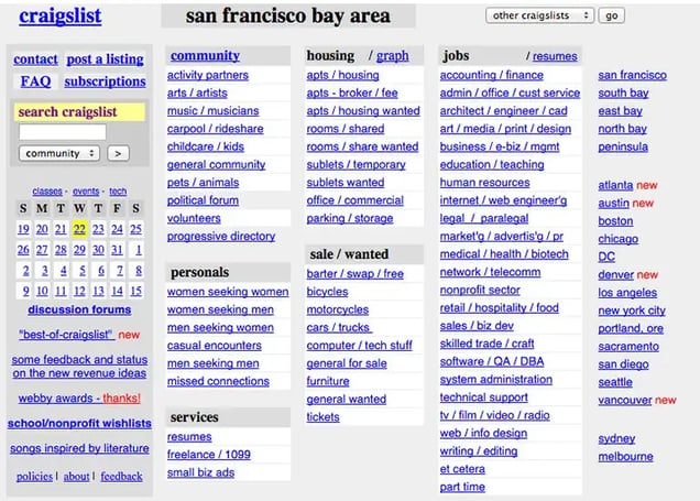
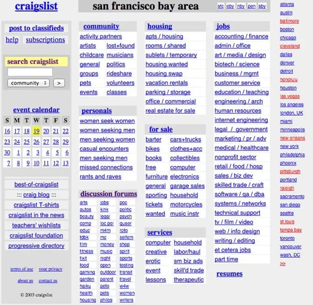
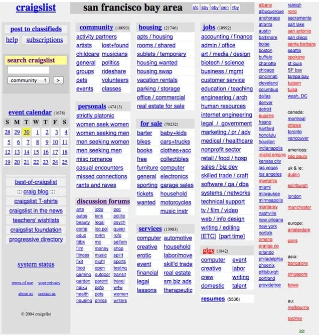
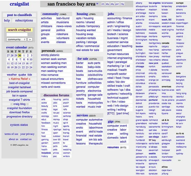
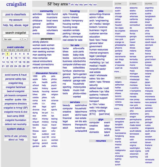
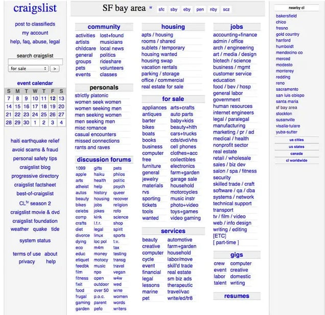
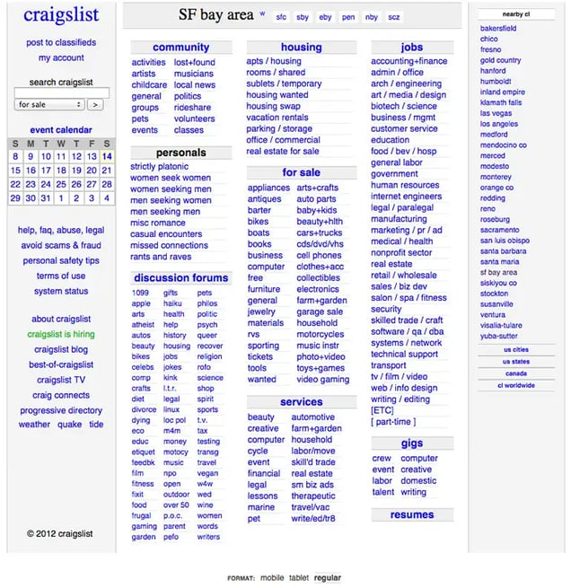
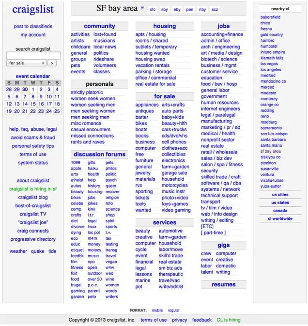
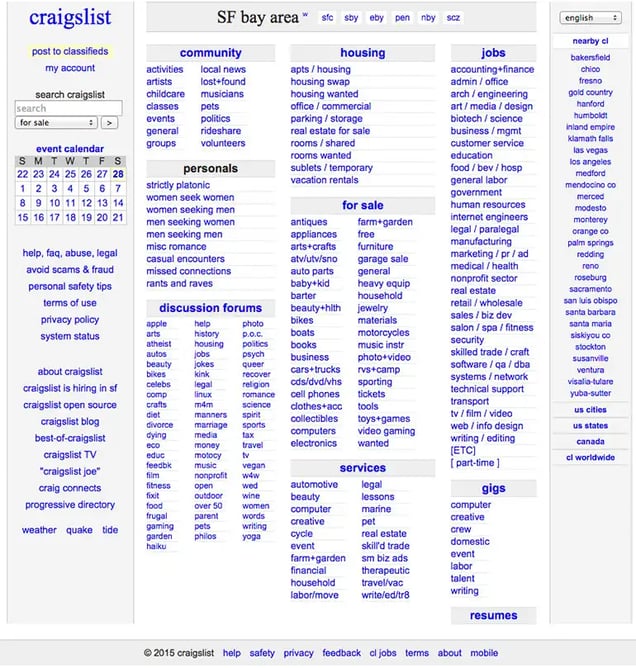
Craigslist
This one is my favorite because Craigslist wins the “I don’t give a damn what you think about good design” award.
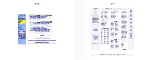
Craigslist started as an email list by Craig Newark in 1995. A year later Craigslist.com launched.
It’s an anomaly in a market that’s constantly rebranding. Craigslist.com has been virtually unchanged over the last 20 years, which I love. Craigslist receives over 50 billion page views a month and is the 9th most popular website in America. They only have 40 people on staff. Thankfully, a designer is not part of the 40.
The evolution of Craigslist.com shows that as long as your site functions properly and solves a problem, then aesthetics don’t really matter.
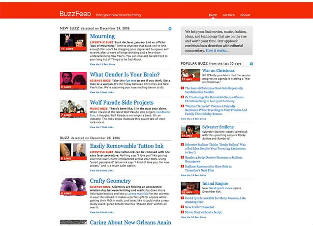
BuzzFeed
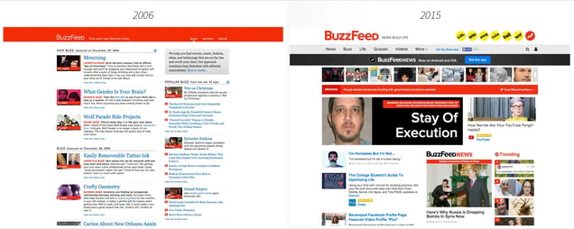
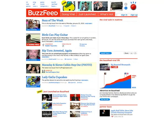
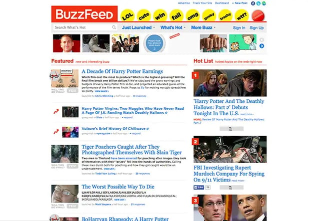
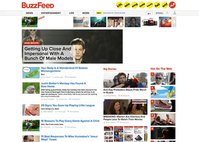
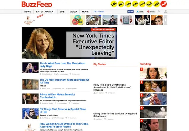
While we’re on the topic of awards, the Nostradamus award goes to Oliver Ryan from CNN. In 2006, when Buzzfeed only had 750,000 visitors a month (they do that each hour now), Ryan said that he “looked at BuzzFeed and sensed the future.” Bravo, Ryan. If only Universal had your foresight.
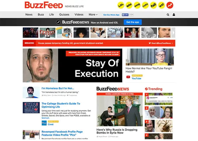
You’ll be amazed to learn that before this project, I had never been to BuzzFeed’s homepage. Look how they’ve increased their photo size over the years as well as the decreasing amount of text on the page.
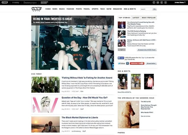
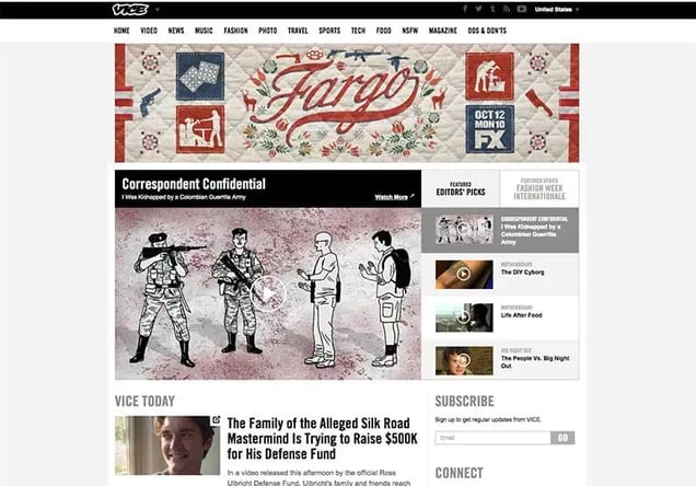
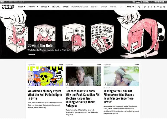
Vice
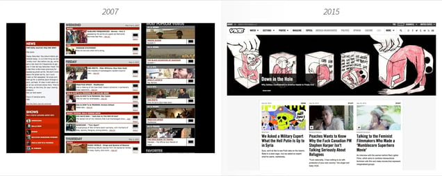
Until 2011, Vice’s primary website was VBS.tv, an online TV network with daily videos. In 2012 Vice, the company became Vice.com. Before that, Vice’s main distribution was their magazine.
What I love about Vice’s evolution is their “Coming soon” page in 2011. It’s a no frills white landing page with a simple email box.
If a hipster landing page were such a thing, this would be it.
Nonchalant, purposely unfashionable yet interesting, and uncaring – except they really slightly care what you think – otherwise the email box wouldn’t be there.
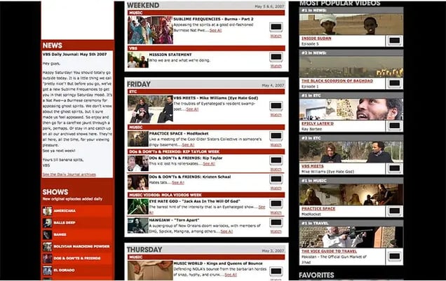
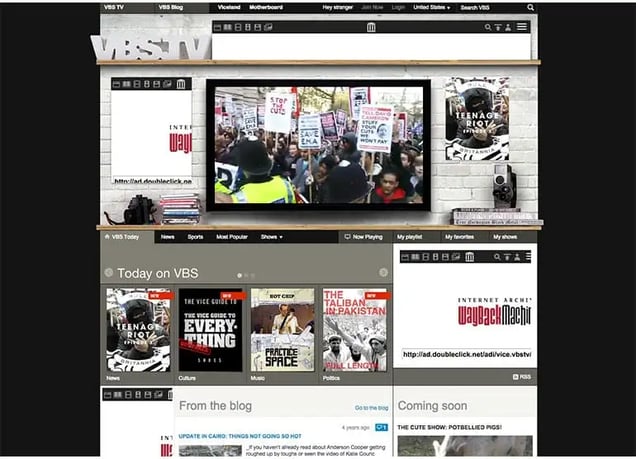
Also worth noting is screenshot of VBS.tv in 2011. Vice, unlike most media companies, ran ads very early on in their existence.
They had a rule of one page of ads for every page of editorial.
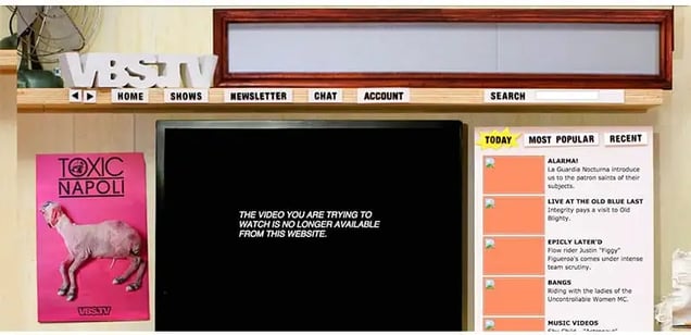
Unfortunately Wayback Machine (which was used to capture these screenshots) doesn’t pick up ads, so I’ll just assume it was advertising a show about having sex with Asian ladyboys.

Thrillist
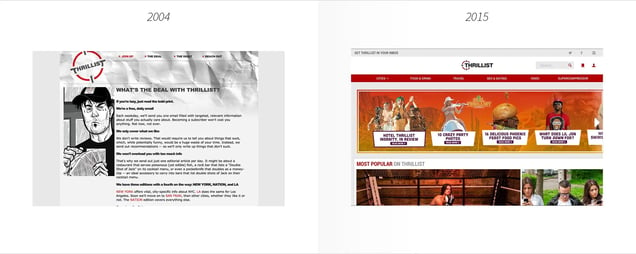
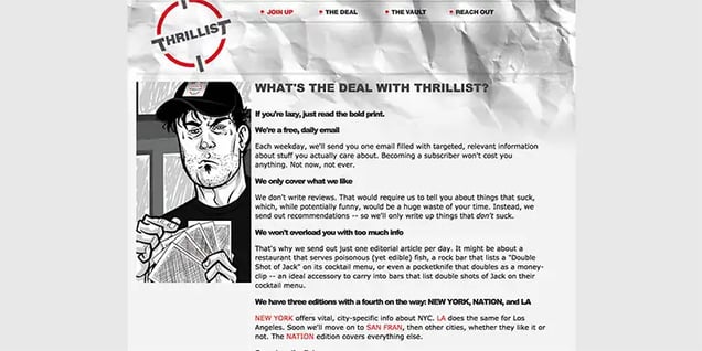
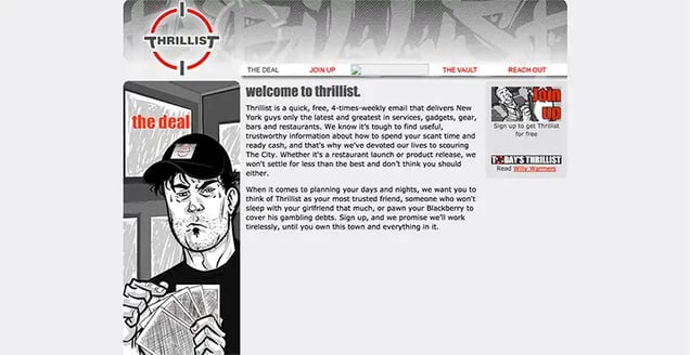
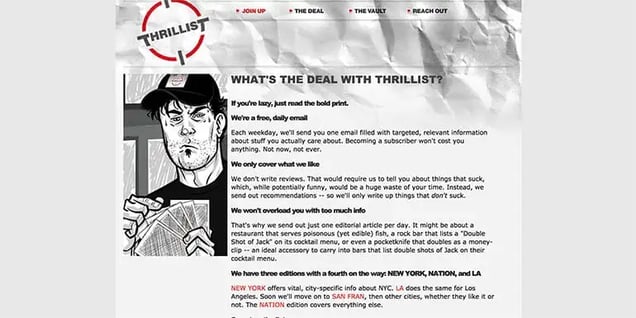
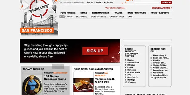
For six years – 2004 to 2012 – Thrillist.com was a very, very, very ugly site. Lot’s of…gray.
In their defence, Thrillist started as a daily email for dudes, so their website wasn’t very important. Interestingly, their first logo design (which they paid $90 for) is the same logo they use today.
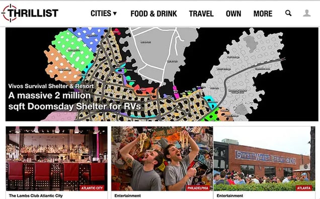
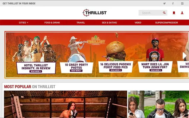
Thrillist.com had a major update in 2012, and they’ve kept building on this.Their homepage today is far less gray and has more boobs, burgers, and ads…everything a testosterone fueled bro wants.
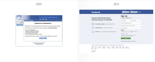
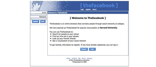
Al Pacino’s beautiful mug was the original face for TheFacebook.com when it launched in 2004.
Facebook’s least popular co-founder, Andrew McCollum, designed The Facebook’s first homepage using a Pacino photo he found online. McCollum added in a few blurred 1’s and 0’s over Pacino’s face and voila – Facebook’s first home page.
The bottom of the 2004 homepage has a line that says, “A Mark Zuckerberg Production.”
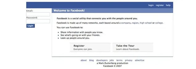
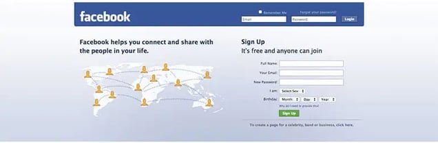
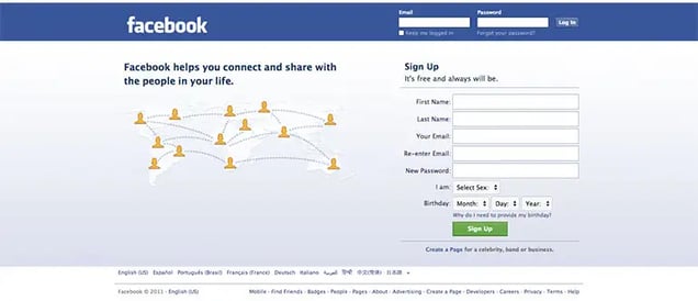
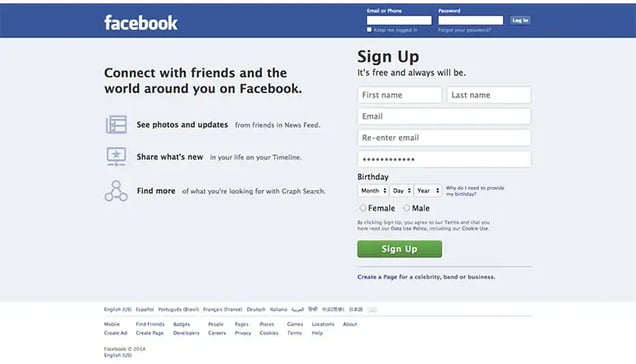
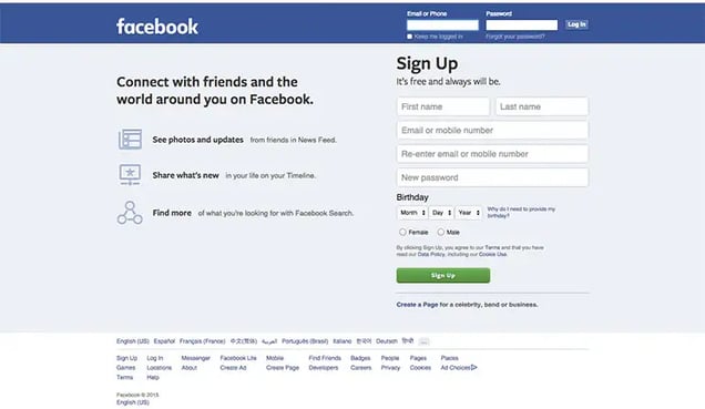
In September of 2005, at Sean Parker’s suggestion, the name changed to Facebook.com. They paid $200,000 for the domain name.Like Craigslist, Facebook’s homepage has stayed relatively unchanged over the last decade.
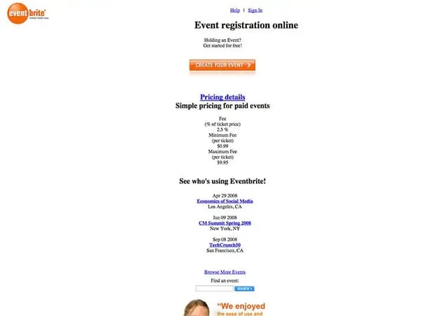
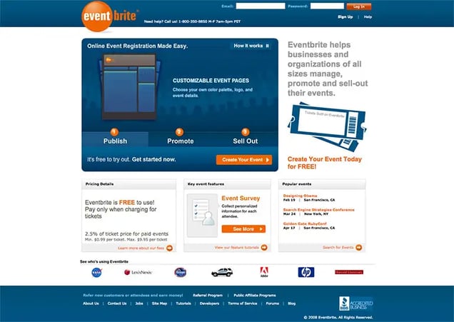
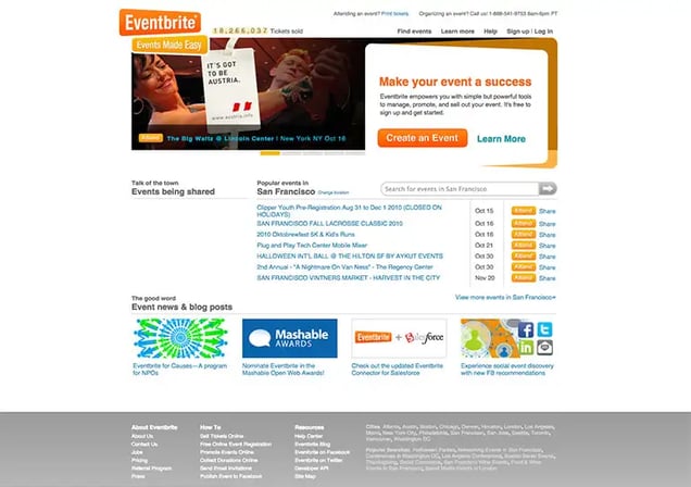
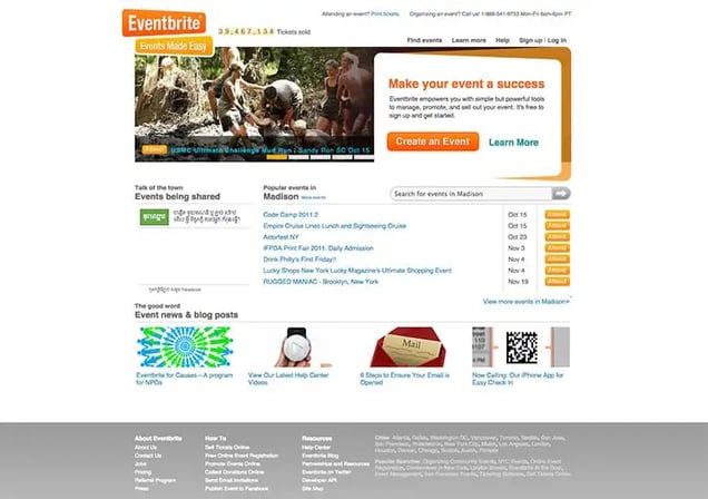
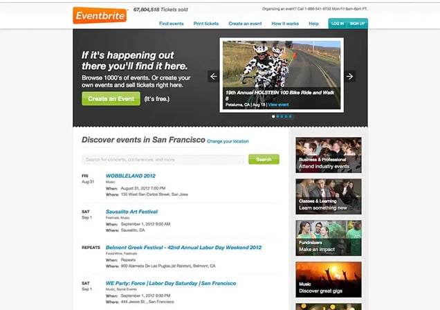
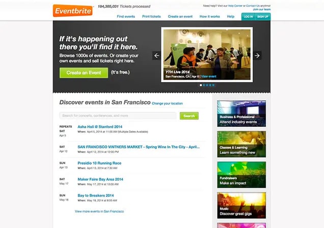
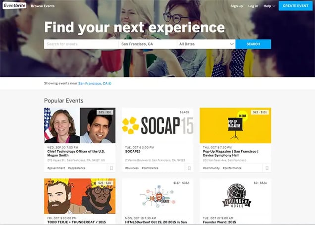
Eventbrite
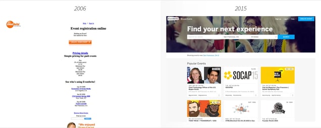
Eventbrite wins the award for most improved website. Since it’s founding in 2006, they’ve done a marvelous job in transitioning from a very simple Geocities style website to a sleek web 2.0 property.
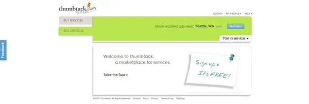
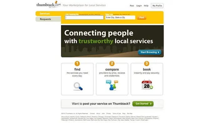
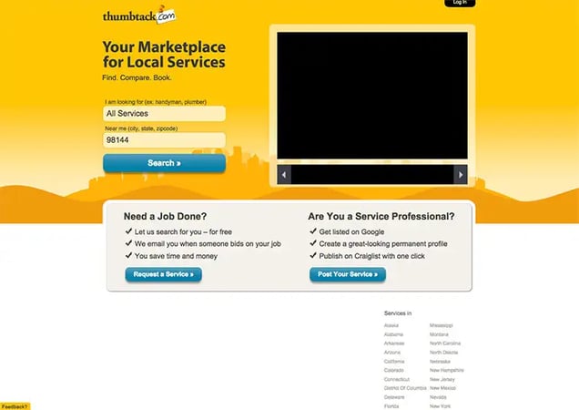
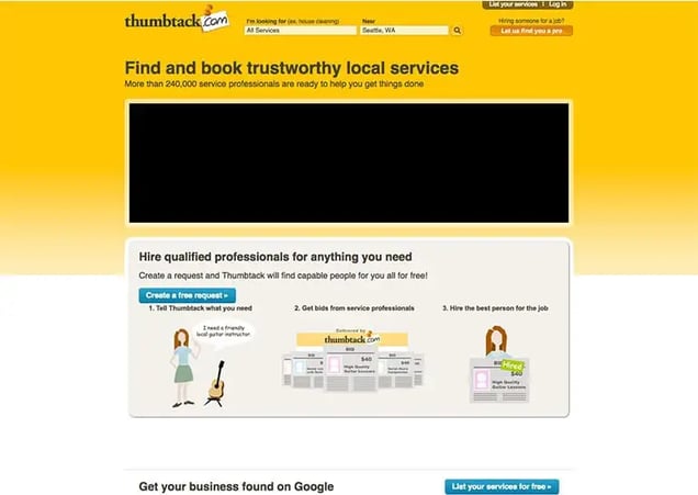
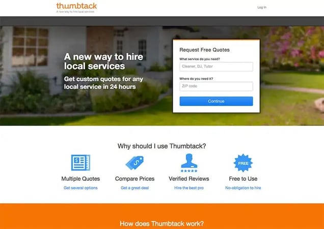
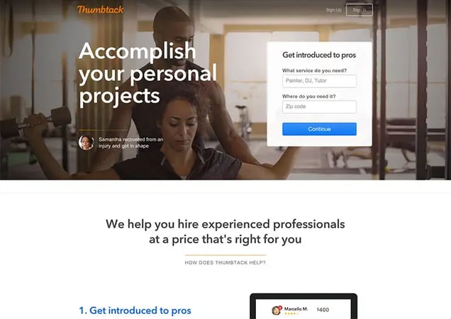
Thumbtack
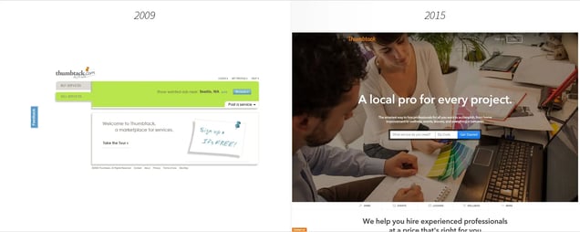
It’s likely you haven’t heard of Thumbtack, but they’re the latest addition to the billion dollar startup club, so I figure they deserve an honorable mention. Thumbtack proves that even successful companies start ugly. Really, really ugly.
If you need inspiration to start something, remember that even the greats started ugly and confused.
Know anyone who needs inspiration? Share this post!
Want more evolution posts like this one? Enter ye ole email in the box below and like us on Facebook.